Visual Edit
Use visual edits to modify UI elements, adjust layouts, and update styling without writing code.
Visual Edit lets you click directly on elements in your app's preview and modify them — text, spacing, colors, and more — without touching the code. Changes are applied to the actual source files automatically.
Visual Edit is currently available for Next.js projects only. Support for additional frameworks is planned for a future release.
No code required
Edit text, spacing, and styles directly on the live preview — the code updates automatically.
AI-assisted targeting
Jump straight to the AI chat with the exact element location pre-loaded, ready for a prompt.
Precise control
Adjust margins, padding, font size, alignment, and color with dedicated inputs and a color picker.
Getting Started
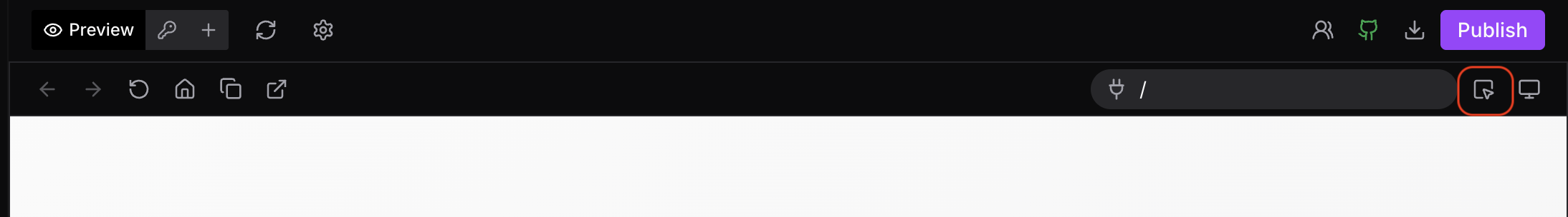
Click the Visual Edit icon in your project to activate the mode.
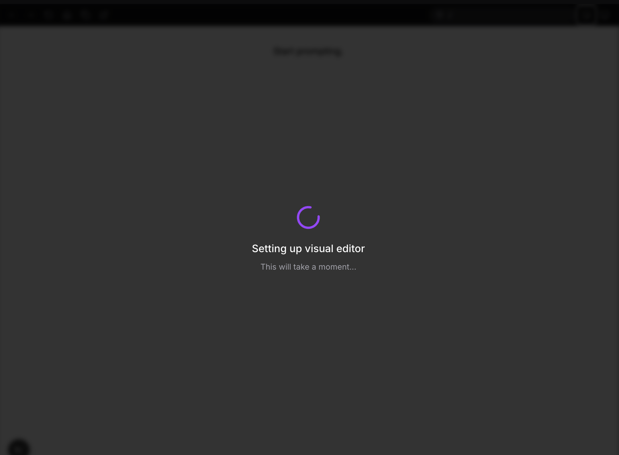
Visual Edit initializes by setting up the necessary tooling in your project. You'll see a brief loading state while this happens.
Once ready, hovering over elements in the preview reveals a tooltip with editing options directly on the element.
What You Can Edit
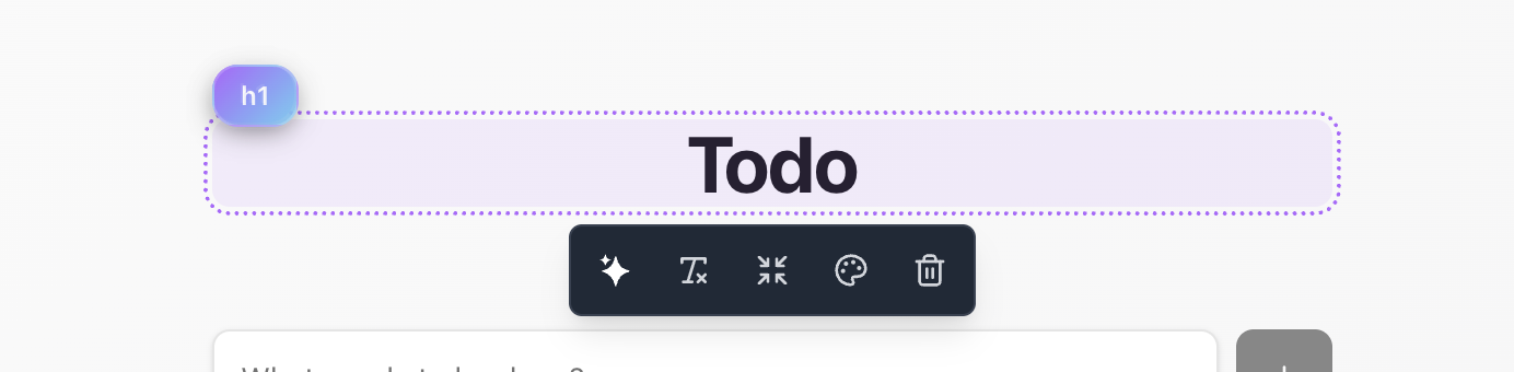
Ask AI
Sends you to the chat input with the element's exact location in the codebase already referenced. Type your change directly — no need to describe where the element is or hunt through files.
Text Edit
Lets you edit the content of HTML text elements like <p>, <h1>–<h6>, <button> labels, and similar tags inline. Click the field and type to update.
If an element's text is dynamic (rendered from a variable or prop), Visual Edit will indicate that the content is dynamic and won't allow direct input. Use Ask AI in that case to make the change through the agent.
Margin & Padding
Provides pixel-level inputs for horizontal (X) and vertical (Y) margin and padding on the selected element. Adjust each axis independently for precise layout control.
Text Styling
Controls for the selected element's typography and color:
- Alignment — left, center, right, justify
- Font size — set in pixels
- Color — dedicated color palette for quick picks, plus a full color picker for exact values
Delete
Removes the selected element from the component entirely. The change is written to the source file immediately.
Shared Components
If you select and edit an element that belongs to a shared or reusable component — such as a common text renderer, button, or card — the change will reflect everywhere that component is used across the project. This is expected behavior, but worth keeping in mind if you intend to change only one instance.
To edit a single instance without affecting others, use Ask AI and ask the agent to extract that instance into its own component first.